Additional Impact
Launched across 4 outlets in Aug 2023, the platform has grown to 24,896+ members and drives over S$300K in monthly membership spending, totalling S$7.13M+ by Apr 2025. With 1,000+ new members joining each month and S$60K in unredeemed membership rebate balance, the system shows strong user trust and sustained engagement. Fewer support complaints post-launch further reflect improved usability.
Problem
With labour shortages affecting the F&B sector, SAKURAYA adopted an i-ordering platform to improve efficiency. However, the system suffered from poor usability—customers frequently struggled to navigate it, and staff often had to intervene. I was tasked with redesigning the platform to improve clarity, flexibility, and overall user satisfaction.
A basic flow with room to grow (User Journey Before Redesign)

User Research
Since the original i-ordering platform frequently required staff to assist customers, I set out to understand where and why customers were struggling.With limited access to direct users, I turned to those closest to the customer experience—conducting in-depth interviews with five frontline staff. I also analysed public reviews on platforms like Google and Facebook to identify recurring pain points and validate internal observations.
Research Goals
Identify key usability issues of the platform from both staff and customer perspectives
Highlight where staff need to step in during the customer journey
Drive a seamless and intuitive self-guided experience
Affinity Map

Key Findings from Affinity Mapping
Customers often rely on staff to help them place an order or make customisation requests.
Users and staff are unsure if orders were placed or missing - which generates the majority of frustrations from the app.
The idea of membership points lack clarity and urgency. A rebate system which displays points in the form of cashback is the easiest to understand, and 6 months is sufficient time to redeem it before expiration.
Seasonal promotions are easy to miss by users without verbal mentions by the staff.
Staff are often overwhelmed with during peak hours, and unable to attend to customers which leads to bad service.
Competitor Analysis
I analysed local i-ordering platforms to identify common patterns, gaps, and inspiration for SAKURAYA’s redesign.

Design Goals
How might we improve the i-ordering experience to reduce staff dependency, increase usability, and drive long-term customer engagement?
Reduce Staff Dependency: Improve the UI and information architecture to make navigation more intuitive—allowing users to complete orders independently with less need for staff assistance.
Improve Order Confidence: Display order history with item summaries, timestamps, and order IDs to reassure users their orders were successfully placed.
Enable Customisation: Support common requests—like “less sauce” or “no mayo”—by offering fixed options tailored to what’s feasible for each product.
Introduce a Membership System: Create a user-friendly digital wallet-style interface that displays cashback rewards (3% rebates) clearly—valid for 6 months from the last purchase.
Highlight Promotions & Add-ons: Introduced a dedicated Promotions tab, slideshow banners on the menu homepage, and brand-coloured add-on buttons during item selection to increase visibility and encourage upsells.
Revamped User Flow with New Features

Low Fidelity Wireframes
Sketched low-fidelity wireframes to map out the core user journey — from login to order confirmation — and align on key features early.

High-Fidelity Wireframes
After aligning on layout and features through low-fidelity sketches, I translated the flow into high-fidelity wireframes. These screens reflect UI improvements, SAKURAYA’s visual identity, and support key user needs.

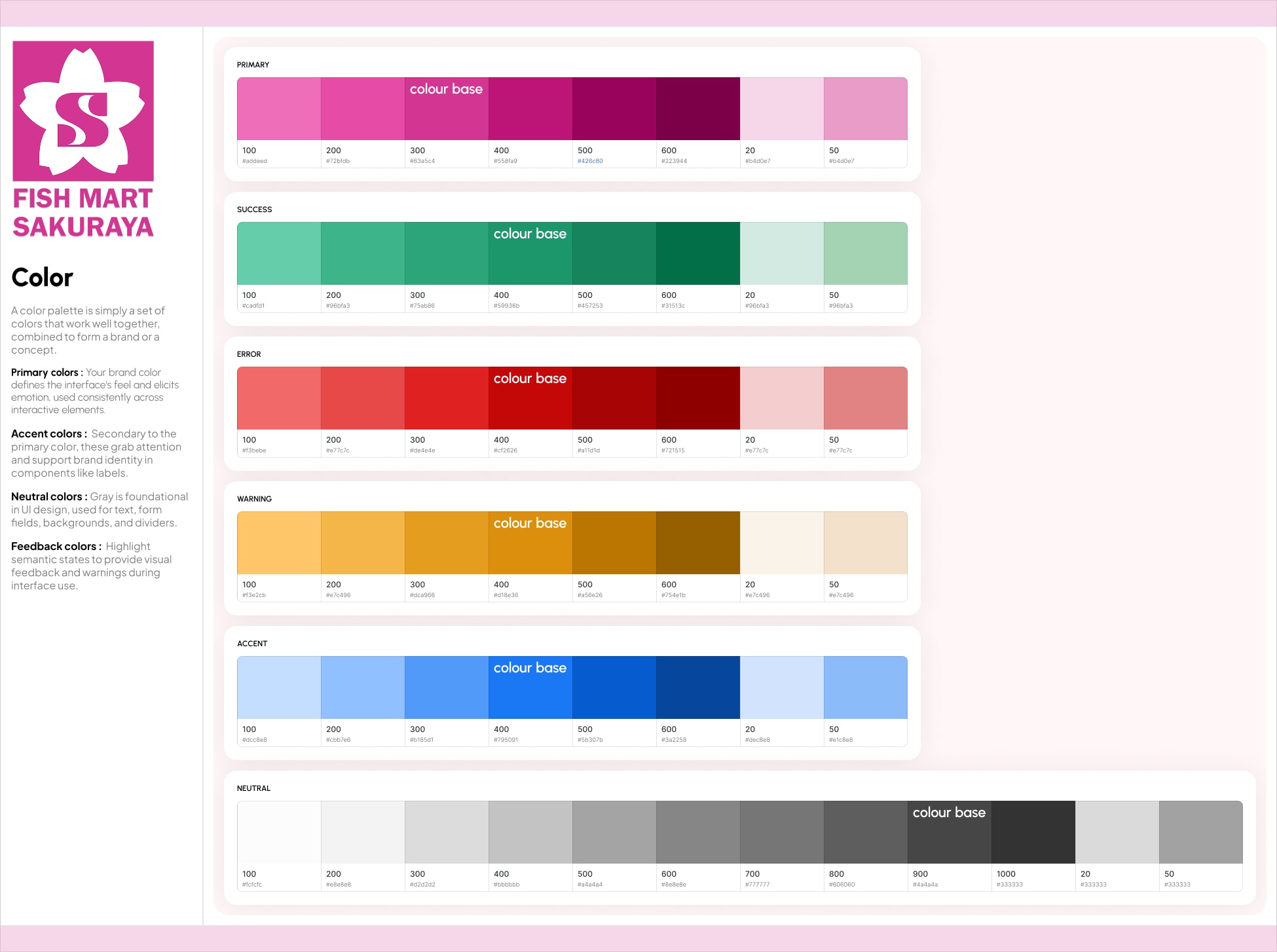
Design System
Built a modular design system with semantic colours, scalable typography, and consistent UI components—ensuring visual clarity, efficient handoff, and ease of future updates.
Outcome & Impact (as of April 2025)
The i-Ordering Web App went live in August 2023 and has since delivered strong results across multiple areas:
📈 Business Growth
S$7.13M+ in total membership spending
+86% increase in Average Order Value
Over S$300K spent monthly by members
💡Loyalty rebates and upsell prompts helped boost revenue per order.
👥 User Acquisition & Retention
24,896+ members joined in 20 months
1,000+ new members added monthly
Over S$60,000 in unredeemed membership rebate balance
💡 Strong member growth and high rebate balances suggest user trust and continued intent to return.
🛠 Operational & UX Impact
50,000+ transactions processed monthly on the web-app
Fewer support complaints after launch
Reduced reliance on staff for help
💡 Improvements in usability, customisation, and order clarity reduced friction for both users and frontline staff.
📊 Promotion Sales Performance
593% spike in Japanese apple sales during Aomori Orin Apple Fair (20–25 Mar 2025) — 1,109 apples sold from initial order of 160 of the highly perishable and premium product
52.25% increase in sales during prefectural fairs (e.g. Kumamoto Fair) from 2022 to 2025
Achieved highest single-day sales in the company’s 37-year history (Mother’s Day 2025).
💡 Improved UX made promos more visible and accessible, driving faster and higher promotional sales.
Reflection
This project taught me to design with both user needs and business growth in mind. While we improved usability and revenue, users mentioned that they wanted easier ways to track rebate balances and expiry aside from visiting in-store. With limited resources, building a full app wasn’t viable—so I’d explore low-effort interventions like email reminders to close this loop. Looking ahead, I see an opportunity to evolve the platform into a more connected, omnichannel user experience across dine-in and e-commerce.

.png)